How I Finally Styled a Spring Mantel That Doesn’t Scream ‘Pinterest Tried Too Hard’
I’ve always had a complicated relationship with mantels.
They’re supposed to be a focal point. A little “moment.” And yet every spring, I’d stand in front of mine thinking: why does this look like a seasonal clearance shelf?
Too many vases. Too many tiny objects. Too much trying.
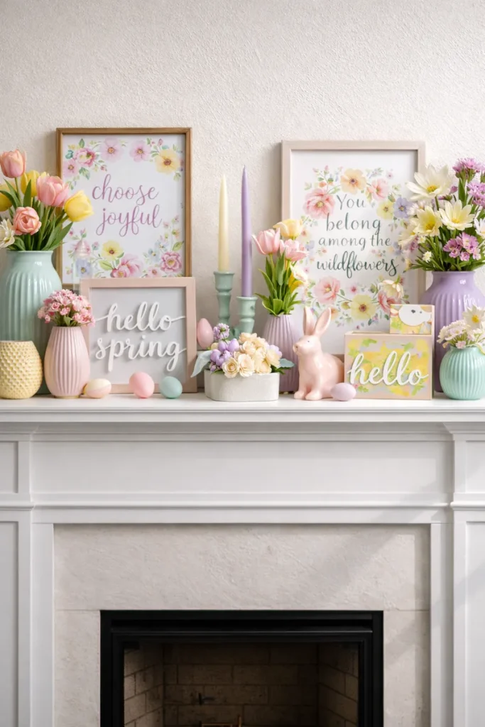
This guide is for spring mantel decor that feels intentional without being busy — the kind of styling that lets the room breathe. No themed clutter. No “Hello Spring” signs in loopy font. Just a mantel that quietly says: this feels nice.
Why Spring Mantels So Easily End Up Overdecorated
The problem is that mantels sit right at eye level. Everything you put there gets noticed instantly — which makes it tempting to keep adding. One more candle. One more vase. One more “something” until the whole thing feels crowded.
Spring makes it worse, because we want the space to feel fresh and new, so we pile on florals, pastel accents, decorative objects… and suddenly the mantel is louder than the room.
An overdecorated mantel doesn’t feel cozy. It feels anxious. And spring should feel like relief.
The Shift That Changed Everything
The biggest change for me wasn’t buying different decor.
It was changing how I thought about the mantel.
I stopped treating it like a display shelf… and started treating it like a sentence.
Every object is a word. Too many words, and the sentence stops making sense.
Quick Checklist: If Your Mantel Looks “Off,” It’s Usually One of These
- No clear anchor (everything is the same “importance”)
- Too many small items competing for attention
- Color overload (spring ≠ every pastel at once)
- No negative space (your eye has nowhere to rest)
- Scale is wrong (the focal piece is too small for the fireplace)
Step 1: Start With One Visual Anchor
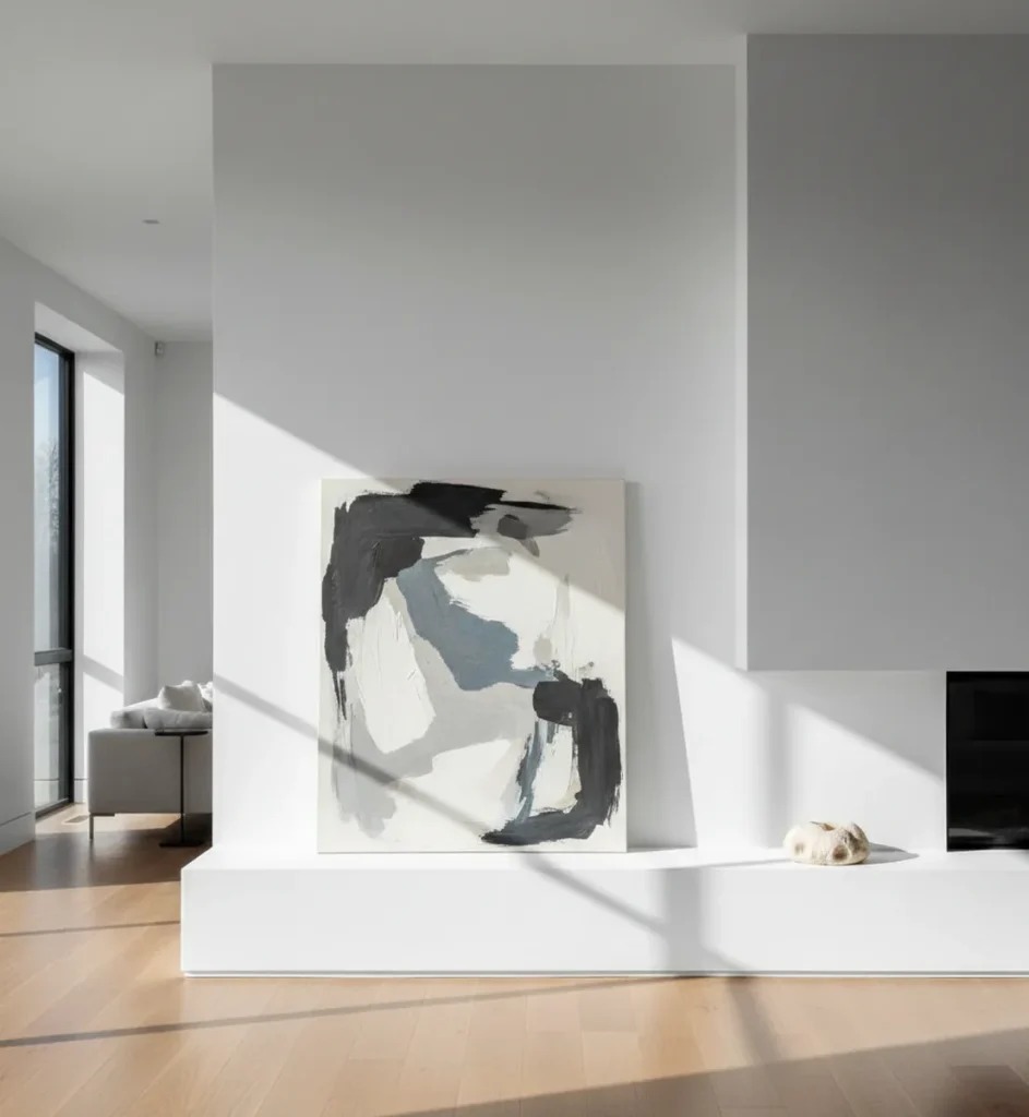
Every calm mantel starts with one strong anchor. Not three. Not five. One.
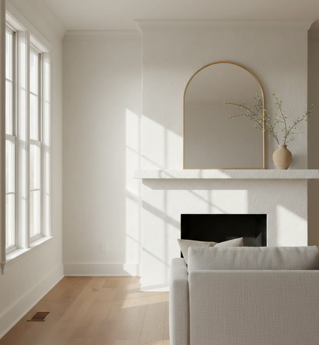
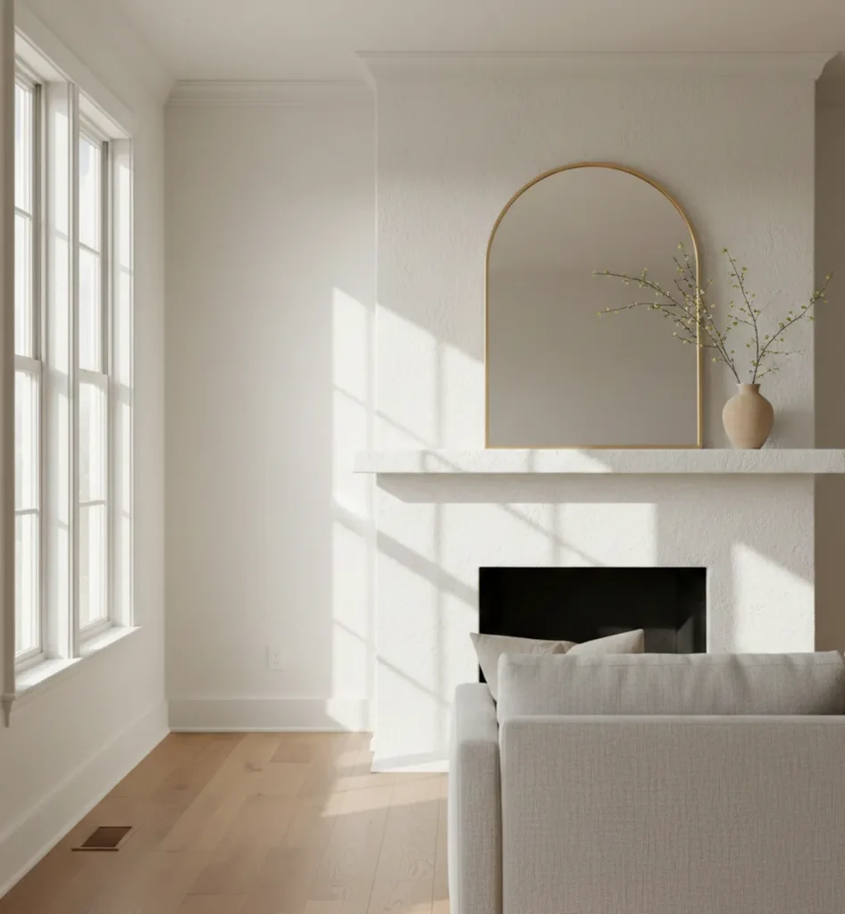
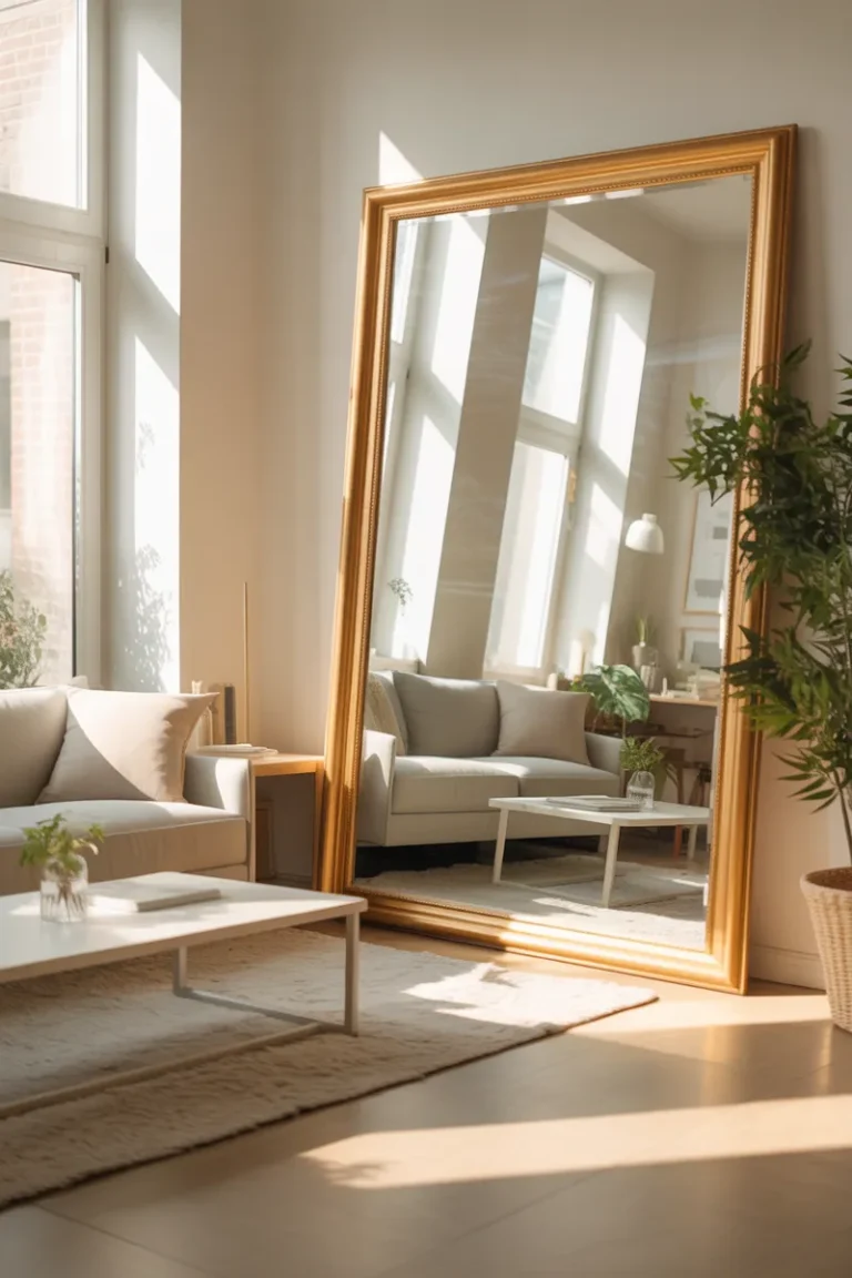
Usually it’s vertical: a mirror, art, or a framed print leaning against the wall. Something that quietly holds the space together.
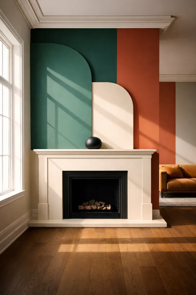
For spring, I love softer shapes and lighter tones — arched mirrors, neutral artwork, simple frames. Anything that reflects light without demanding attention.
Scale tip (this fixes so many “why does it look weird?” problems)
A good rule of thumb: your anchor (mirror/art) should be around two-thirds the width of the mantel. If it looks tiny when you hold it up — it probably is.
Step 2: Add One Organic Element (Keep It Simple)
Spring mantels often go wrong right here. Too many stems. Too much height. Too much color.
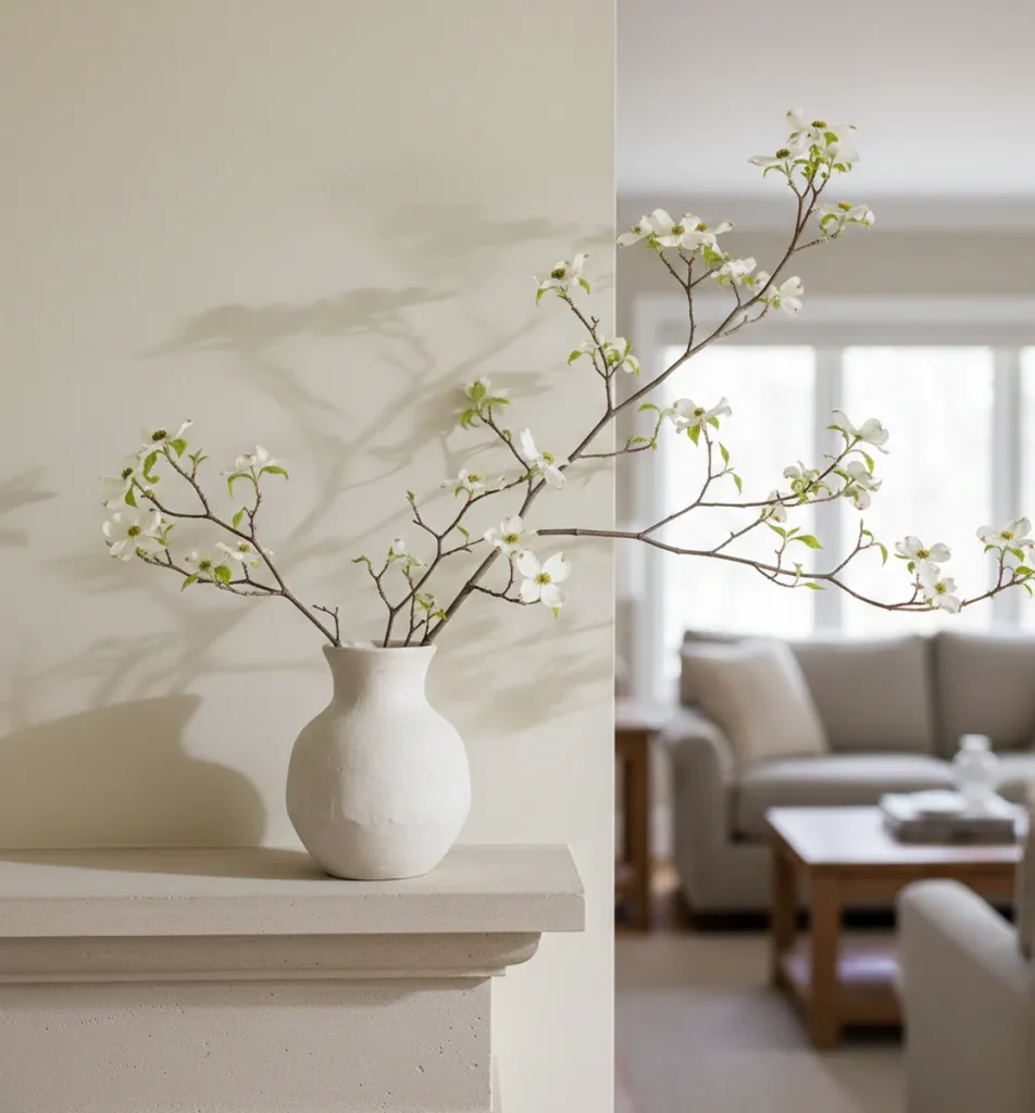
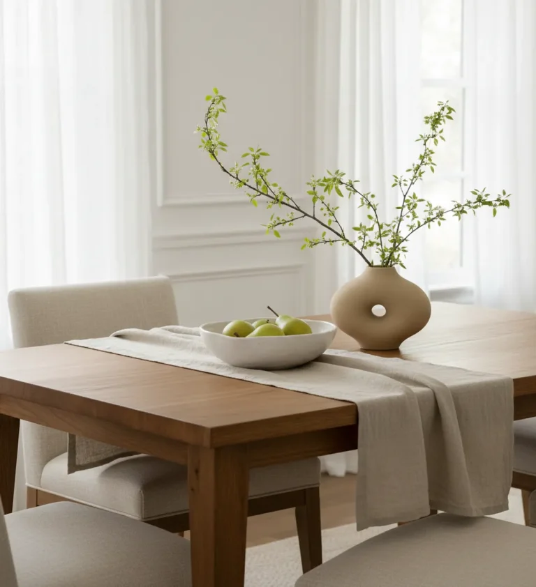
For a calm mantel, your greenery or flowers should feel like a whisper, not an announcement.
Pick one organic element and commit to it:
- eucalyptus
- olive branches
- dogwood/cherry blossom branches
- simple tulips (one color)
- pussy willow
If you want repetition, repeat the same thing — not three different types of spring greenery fighting each other.
If you use faux flowers
High-quality faux stems can look beautiful on a mantel because they hold their shape and don’t drop petals or pollen. The key is choosing stems with natural movement and avoiding anything overly glossy or “plastic-perfect.”
Step 3: Use Texture Instead of More Stuff
When a mantel feels flat, the instinct is to add objects. What it usually needs instead is texture.
Texture creates depth without visual noise:
- rough ceramic next to smooth glass
- matte finishes against subtle shine
- natural wood paired with stone, plaster, or brick
- linen draped lightly (not a heavy “mantel scarf” situation)
Negative Space Is Not “Empty.” It’s What Makes It Look Expensive.
This part is uncomfortable for a lot of people. Empty space can feel unfinished — like you forgot something.
But negative space is what keeps a mantel from tipping into overdecorated territory. It gives the eye a place to rest. It lets each object feel intentional.
If you’re unsure, remove one item and live with it for a day. The calm usually shows up before the doubt fades.
Spring Colors That Don’t Overwhelm
Spring color doesn’t have to mean pastel overload.
On a mantel, color is amplified. A little goes a long way.
I like a neutral base — warm white, beige, light wood — plus one soft seasonal tone:
- sage green
- dusty blue
- muted blush
- soft yellow
If the color grabs your attention before the shape does, it’s probably too much.
Pick One: Symmetry or Asymmetry (Don’t Do Both)
Symmetry feels calm and grounded. Asymmetry feels collected and a little more creative.
Both can be beautiful — but trying to do both at once creates visual confusion.
If you want “effortless,” symmetry is the easiest path: mirror centered, matching vases, one small cluster of candles.
A Real-Life Fix: “It’s Too Much… But Somehow Still Not Right”
Last spring, a friend sent me a photo of her mantel and said: “Why does this feel like too much, but also not right?”
The answer was simple. She had too many small items competing for attention — candles, frames, vases, signs — all the right pieces, just all at once.
We removed half of them.
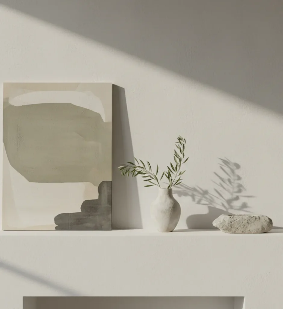
Kept one anchor (art). One vase with spring stems. One low ceramic object to ground the space.
The mantel stopped shouting and started breathing.
4 Spring Mantel Setups You Can Copy (Pinterest-Friendly)
1) The Calm Minimalist Mantel
One mirror or art piece + one vase with greenery + one low grounding object (wood bowl or ceramic). Done.
2) The Soft Cottage Mantel (Not Cluttered)
Several small vases, but all similar in tone (clear glass or white ceramic). One stem per vase. Tight palette: whites + greens.
3) The Natural Elements Mantel
Branch/driftwood as the anchor + woven basket texture + one living plant. No florals required.
4) The Layered Neutrals Mantel
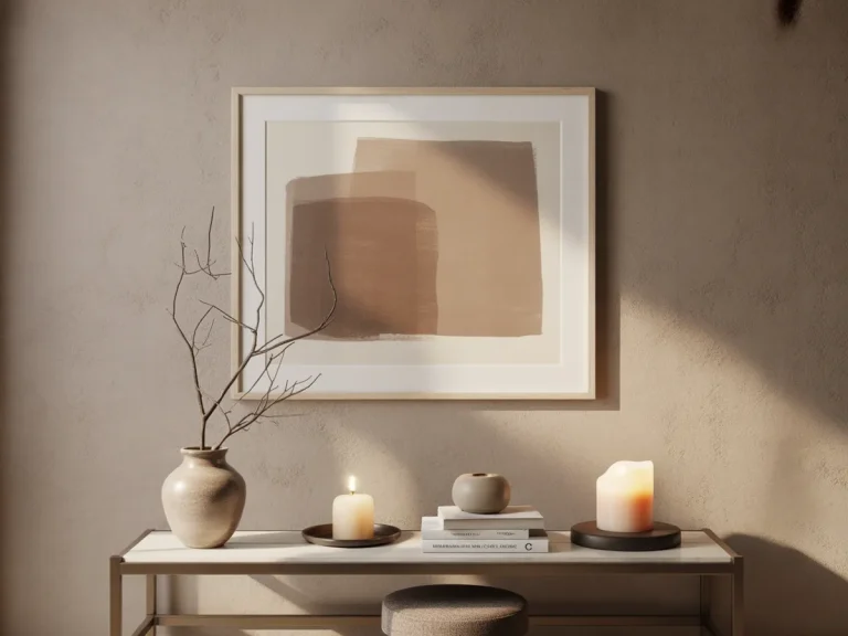
Pick three neutrals (cream, taupe, warm gray). Mix materials (linen, ceramic, wood). More objects allowed because the palette stays calm.
How to Know You’re Done
There’s a moment when you’re decorating and you think: “Does this need one more thing?”
Usually, if you’re asking that… the answer is no.
Step back at least six feet. Look at it like you’re seeing it for the first time. If one piece feels like it’s trying too hard — remove it.
What I’m Skipping This Spring (Because I Want It to Last All Season)
- Anything overtly Easter
- Word signs (they date quickly and pull focus)
- Anything shiny-plastic-crafty
Spring doesn’t have to be themed. It can just feel lighter.
Final Thought: Let the Mantel Support the Room — Not Dominate It
The best spring mantel decor ideas don’t draw all the attention to the mantel itself.
They echo the room’s mood — like a supporting character who makes the whole story better without stealing the scene.
If your mantel feels calm when you glance at it, you’re doing it right.

